WEBSITE REDESIGN: US Department of Labor website.

Project Focused on the US Department of Labor (DOL) Website.
Our team has the task to evaluate and redesign a government website, specifically the Department of Labor website.
Department of Labor website is for Workers, Government labor agencies, Employers, and Employees with the mission statement that states “To foster, promote, and develop the welfare of the wage earners, job seekers, and retirees of the United States; improve working conditions; advance opportunities for profitable employment; and assure work-related benefits and rights”.
Our plan is to make the website, easy to navigate by everyday users like Employers, workers, and retired workers. In a way that it will be understandable and easily accessible.
Project Overview
Problem Statement and Solution
Workers in the United States needs access to labor Information, and get employment benefit often provided to them. They need a platform that can give them complete information about how to navigate the labor benefits. How might we help them find the information they need, easily on the US Department of Labor website, so they could have an easy, understandable website to source labor information?
Solution
We are going to evaluate and redesign the Department of labor website to allow more understanding of the layout and increase site navigation.
User Research and Analysis
Because this is a redesign. we performed a targeted Heuristics evaluation and Page Annotation to isolate our design priorities and the UX focus of the website. The User interface was also analyzed by the annotation of the current website.
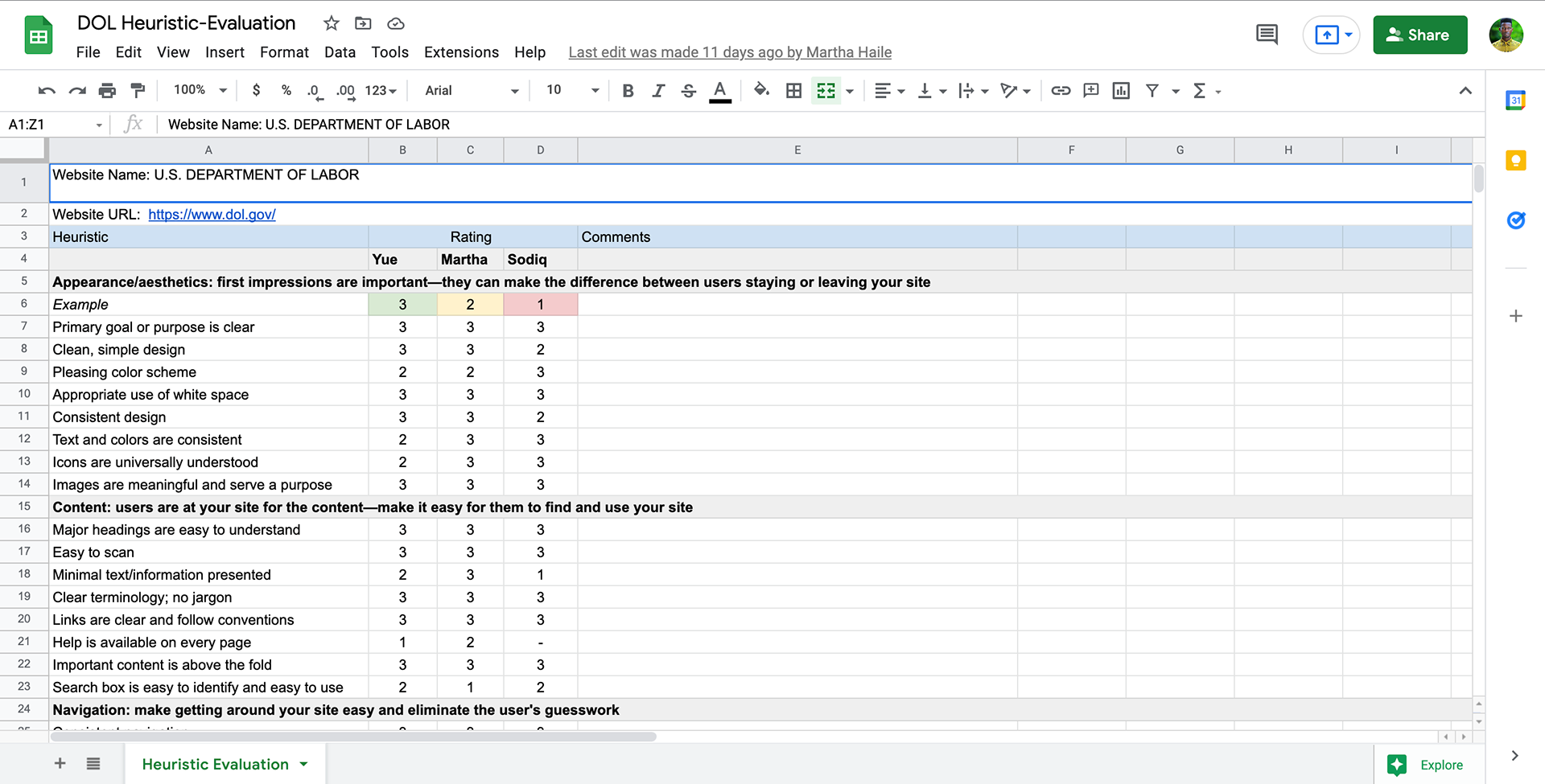
Heuristics Evaluation
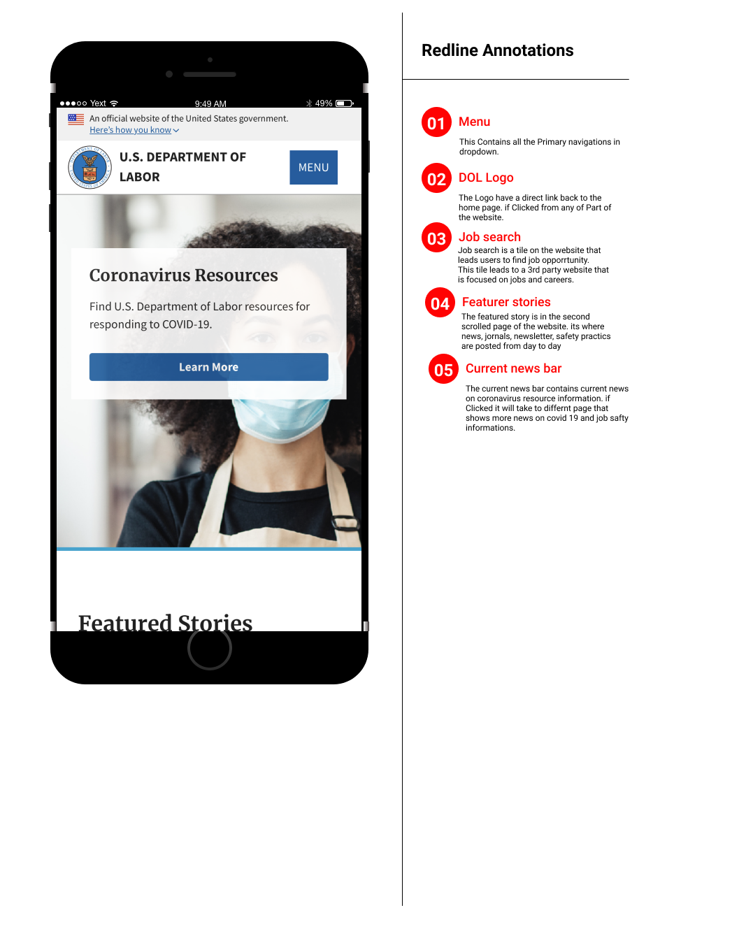
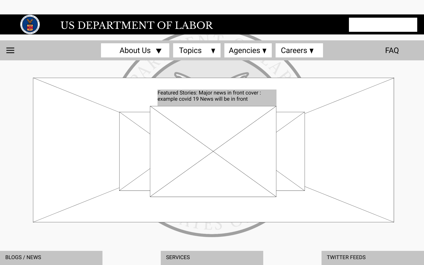
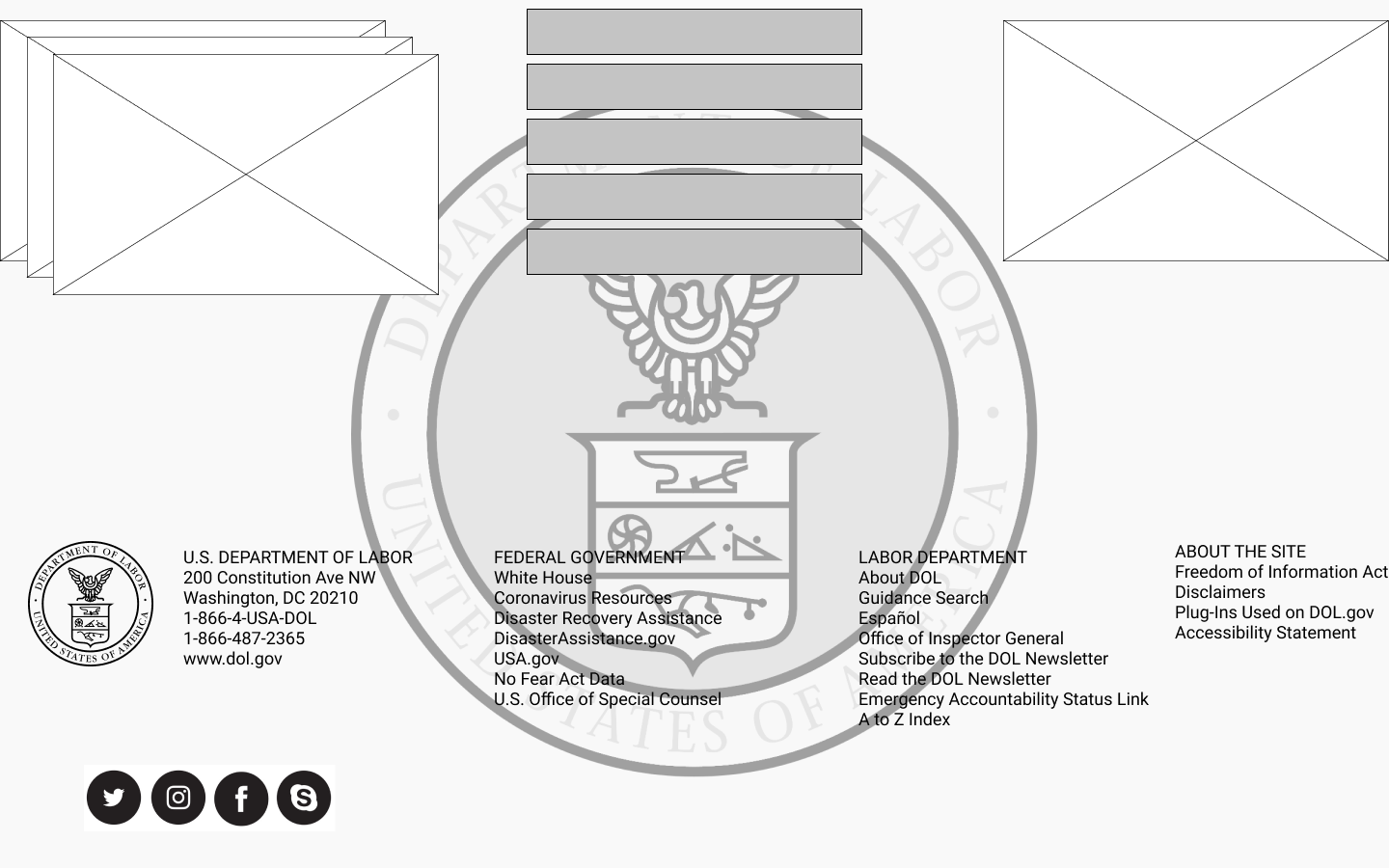
Website Annotation

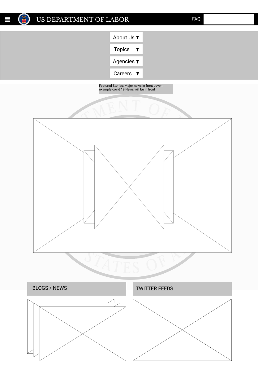
Responsive Website Annotation


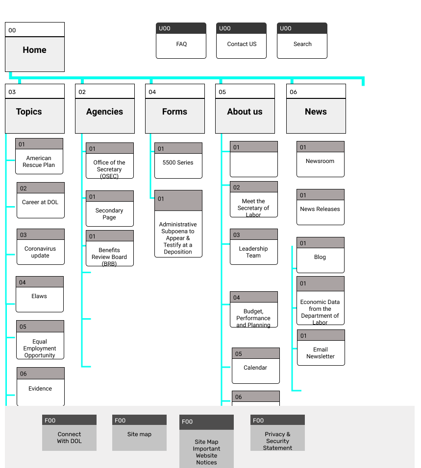
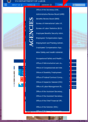
Site Map and Card Sorting
For the benefit of users that constantly come to the website, we checked the site made of the current website, so we can understand the information flow as well as the accessibility and usability of the website.
Card Sorting
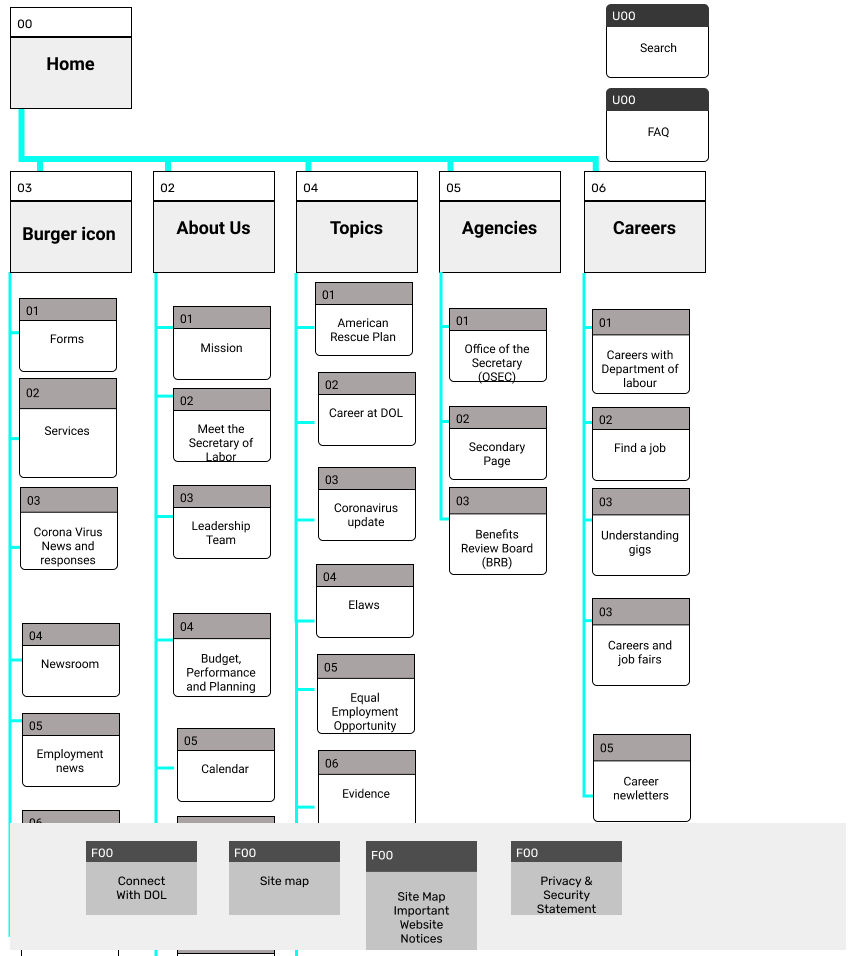
The card sorting required that we properly arrange the information hierarchy of the website these helped us to focus on key topics of how we want our website to interact. The team decided to keep intact some of the primary navigation of the website and change the rest. We conducted the card sorting on miro.
NEW SITE MAP, REDESIGNED SKETCH, AND WIREFRAME


STYLE GUILD
The style guild will be our universal accepted parameters and appearance of the website, the style guild will act as a global standard sheet or the standard for the website, this piece of document will make sure date regardless of who is designing or when a design is put together the style of the website will remain the same. The style guild will contain the following.
The color scheme
The typography
styling
Iconography
direction and sizes of the elements on the website.

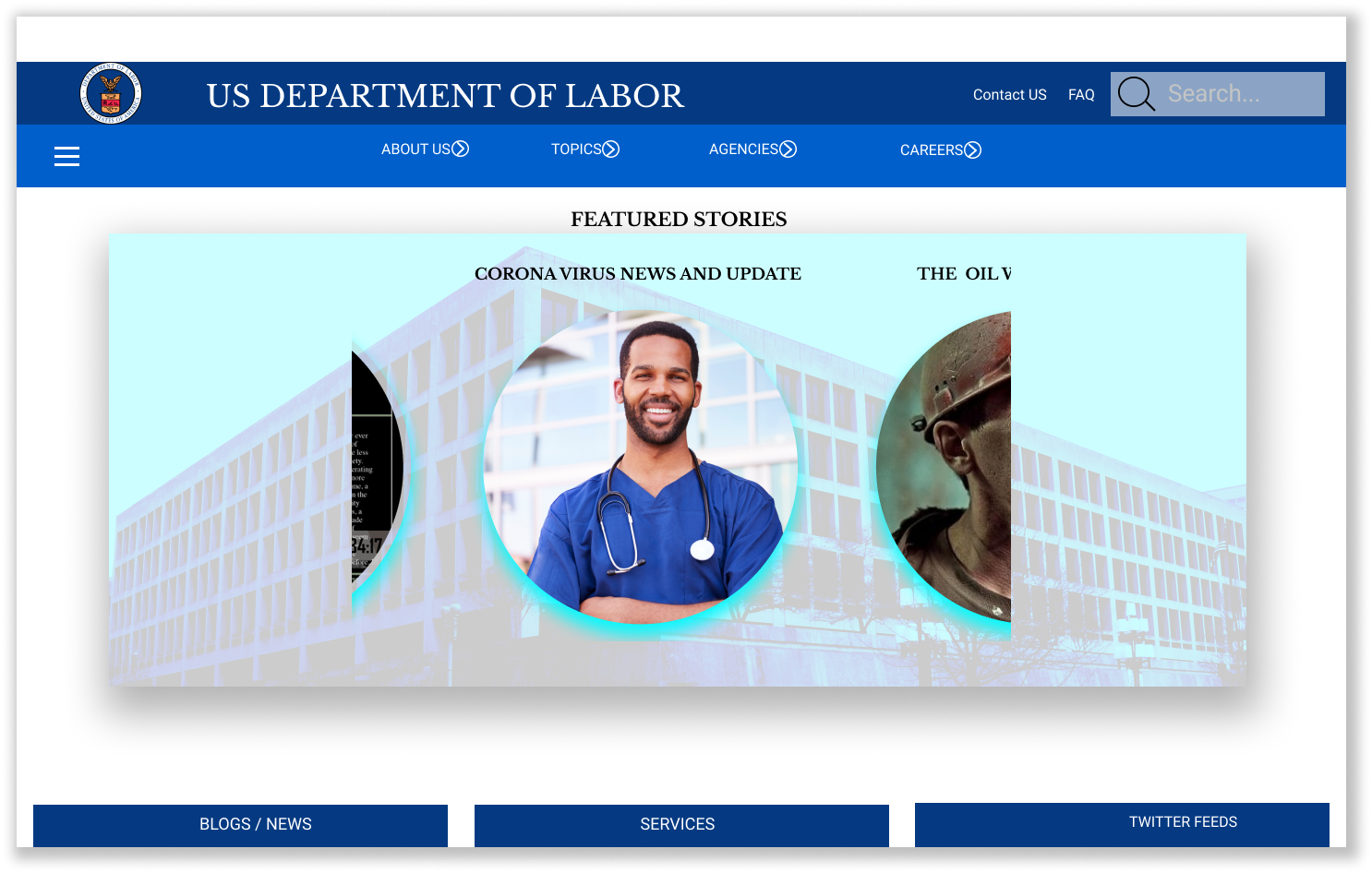
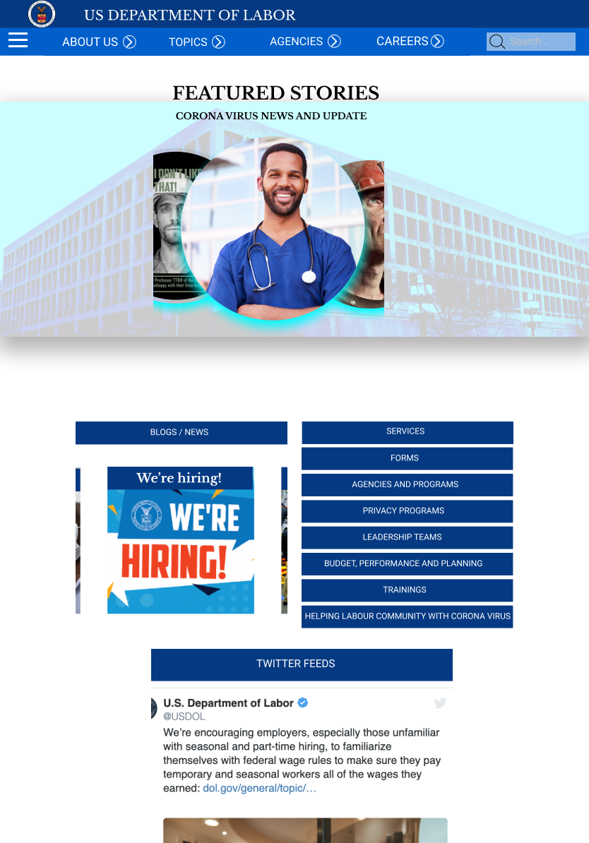
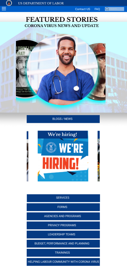
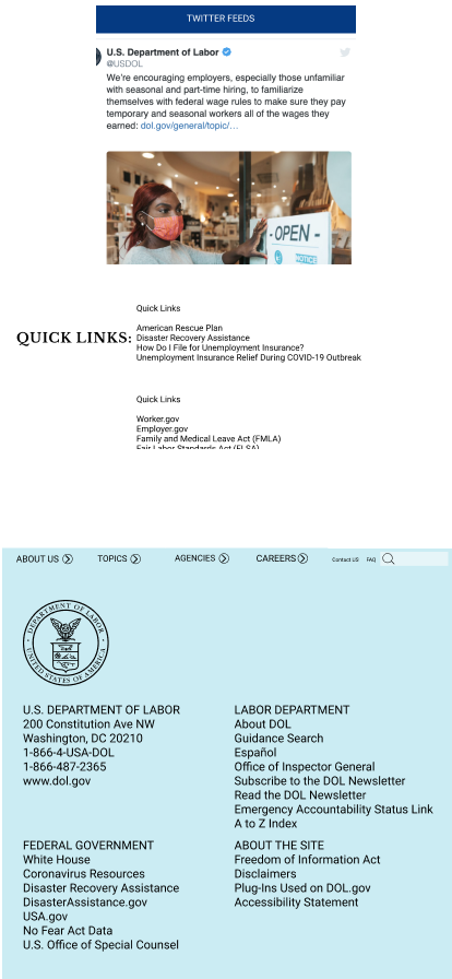
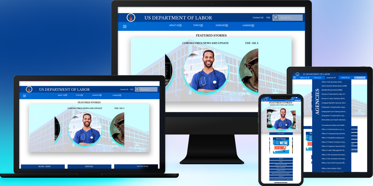
Hi-Fi RESPONSIVE DESIGN
The responsive high fidelity design is a full implementation of the style tile and style guild to achieve the realistic prototype of our design and we made it responsive to Tablet users and mobile users. this will diversify the usability of the website across different devices and screen sizes
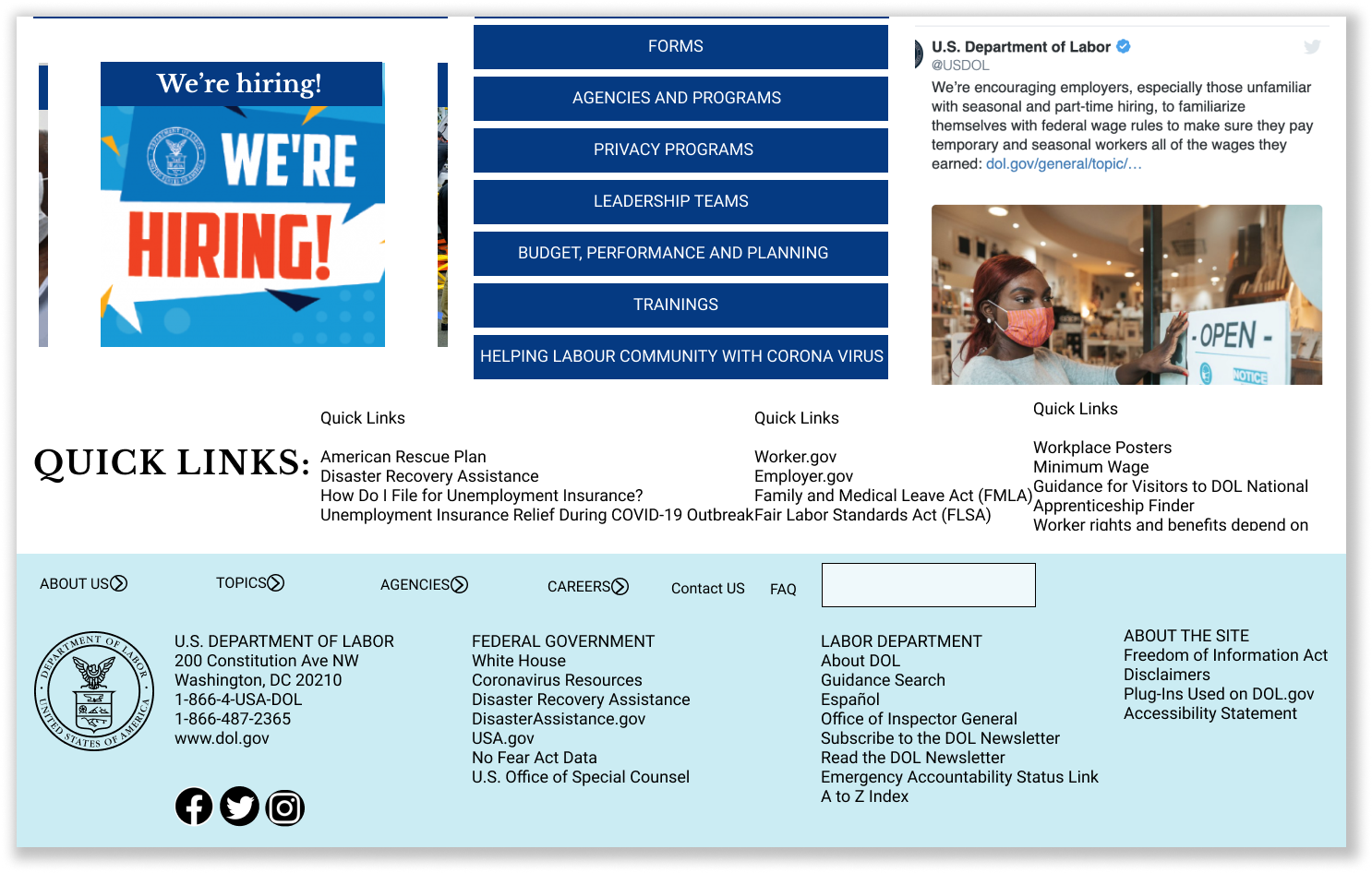
TABLET AND MOBILE RESPONSIVE

REDESIGNED WEBSITE TESTING
We tested the website again based on the current website user flow, our testing plan was aimed at achieving the best user result and easy navigation of the website.
The goal of this testing is to know the following; Complete 4 different tasks on the redesign responsive website, testing the Tablet, the web, and the mobile design
Check the responsiveness of the primary and secondary navigation design of all responsive designs ( tablet, mobile, and Web)
Navigate to read the mission statement from any of the designs, and give feedback.
Navigate and read about the secretary of Labour from any of the designs and give feedback.
Assuming you need to download a form, navigate on the web design to see if you can access the forms.
KEY FINDINGS FROM USER TESTING
Problem 1 :
All scrolling plugins should have an indicator like a scroll bar or arrows showing scrolling directions.

Problem 2 :
Faster interactions
Problem 3 :
Reduced size of secondary navigation in the tablet and mobile flow. Fixed scrolling of the bold side headers.
For example:
FINAL DEDUCTION AND CONCLUSION
We considered the following objectives in the redesign process of this project:
Usability of the Website
UI responsiveness to different screen sizes for brother user experience
A simpler website with easier access to key information for everyday users of the Department of Labor Website.
The challenges we faced for the redesign were minimal especially because we planned extensive testing of both the website and the redesigned project.