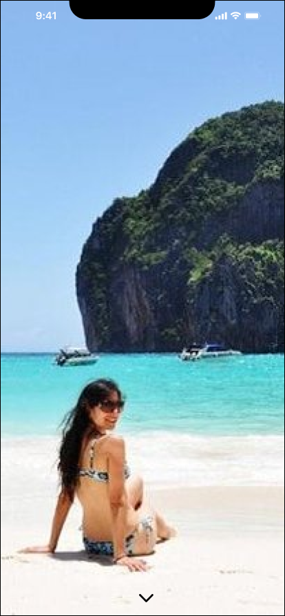
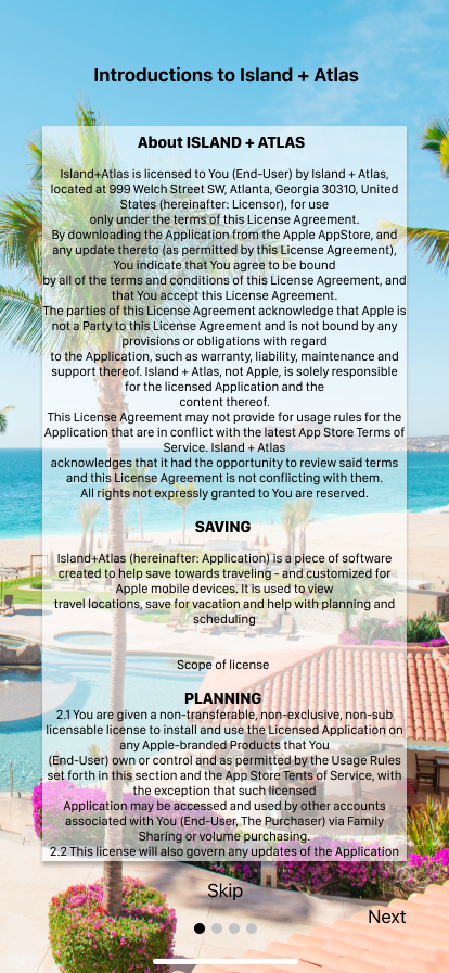
PROJECT OVERVIEW
This is my first design as UX/UI designer, this design was from a fresh mind and there were a lot of opportunities for improvement. The project is a travel concept that allows users to plan their dream travel by exploring all the options that will allow travel planning and budgeting seamlessly and easily. The project started by asking relevant questions that will give an understanding of why a user doesn't meet their travel dreams during a period of their life.
PROBLEM
People make enough money to go on vacations but don’t know where to go and how to save and budget for vacations.
SOLUTION
Design an app that will Plan, help budget, suggest saving plans, and suggest pleasurable destinations.
PROTO PERSONA

This proto persona was created with the intention to streamline the target users for the research phase.
It was important to have a general idea of the frustrations and the pains as well as the demographics of the kind of users this app targets.
The Proto persona here Shei is a 32-year-old mother that finds travel planning extremely difficult to follow, especially when it comes to saving for the trip and fixing a schedule.
The only thing she can wrap her hands around is she is sure to see a good location and want to be there.
We want to plan this for here seamlessly. BUT how do we fully understand her needs?
USER RESEARCH
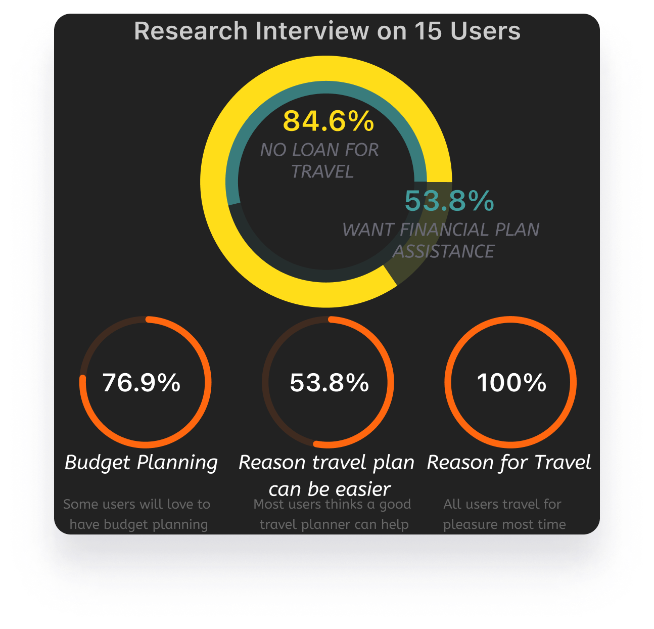
In this research project, I planned and conducted 15 interviews with potential users in Atlanta, Houston, and North Carolina.
App name suggestion: Travel Day, wonder worlds, global, Vacation + atlas, ISLAND + ATLAS.
Interviews were conducted in 3 different ways.
Through Zoom calls: This interview will be conversational and will have other insight into the research as other questions will arise from the conversation. However, a summary of the response will be plugged into the research spreadsheet with a recording device or voice notes: this will be conversational, and there recording will be transcribed and plugged into the research spreadsheet.
Google forms: this will be used to reach larger and more random Users, the form will contain the questions and the responses will be typed into short answers and statements. The result will be extracted onto a spreadsheet for analysis.
RESEARCH OBJECTIVES
Objective 1:
I want to know what a user needs financially to plan a successful vacation.
Objective 2:
I want to know why a working user, with enough salary or income, can not save enough for vacation.
Objective 3:
I want to know, why a user can not find a good vacation destination.
RESEARCH RESULT
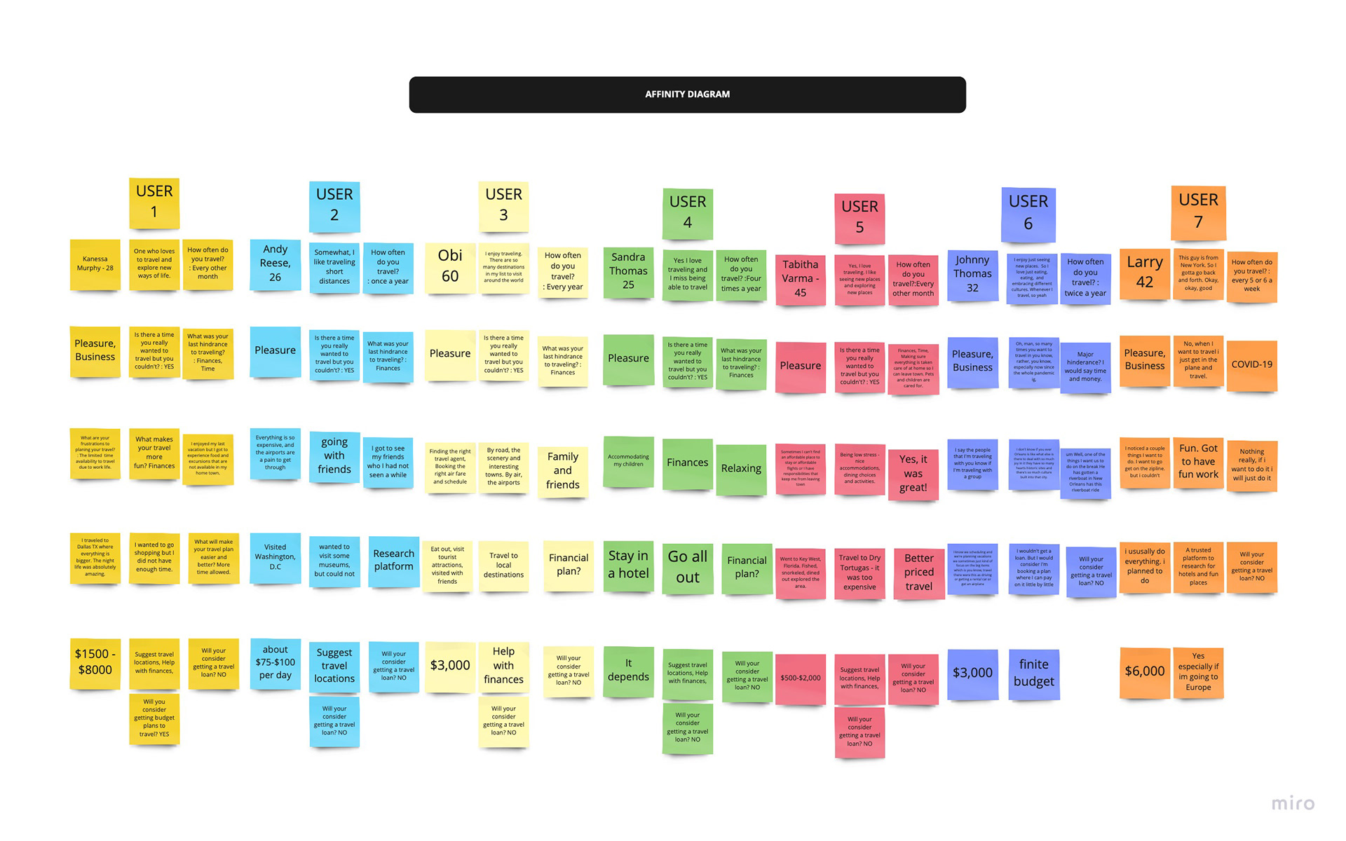
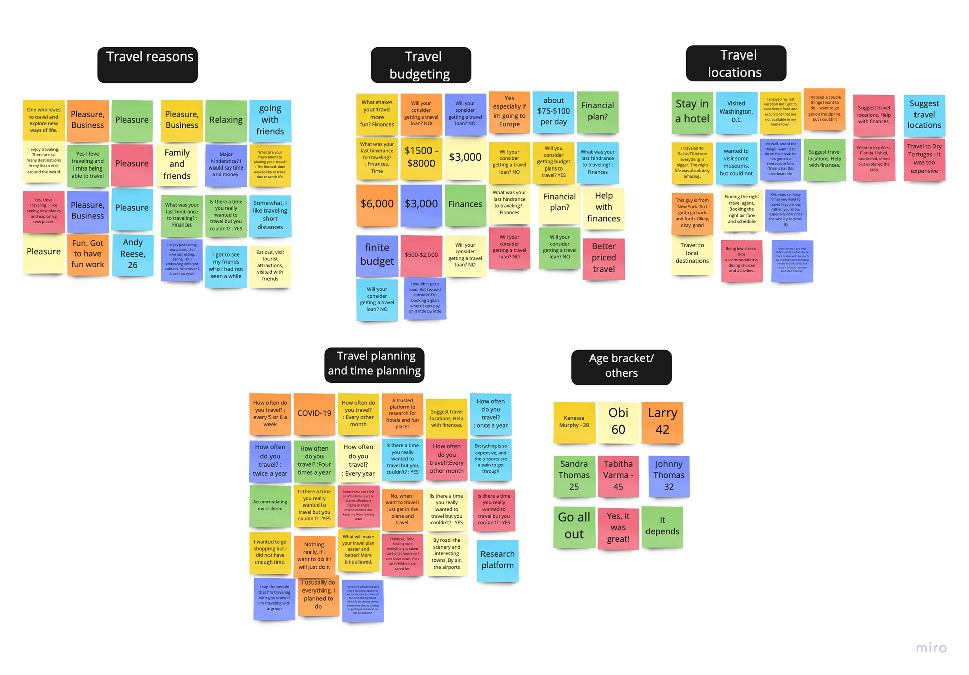
AFFINITY DIAGRAM
The Affinity diagram was achieved after plotting snips from the interview, I was able to categorize all our users into 4 major groups and findings. The reason people Travel, How people budget and achieve their target for travel. What are people's travel locations, and How and when the ravels are planned?
This affinity diagram provides major solutions to the stated objectives of our research. it gave us a sense of progress to continue the project and develop the major product that can satisfy the objective.
EMPATHY MAP
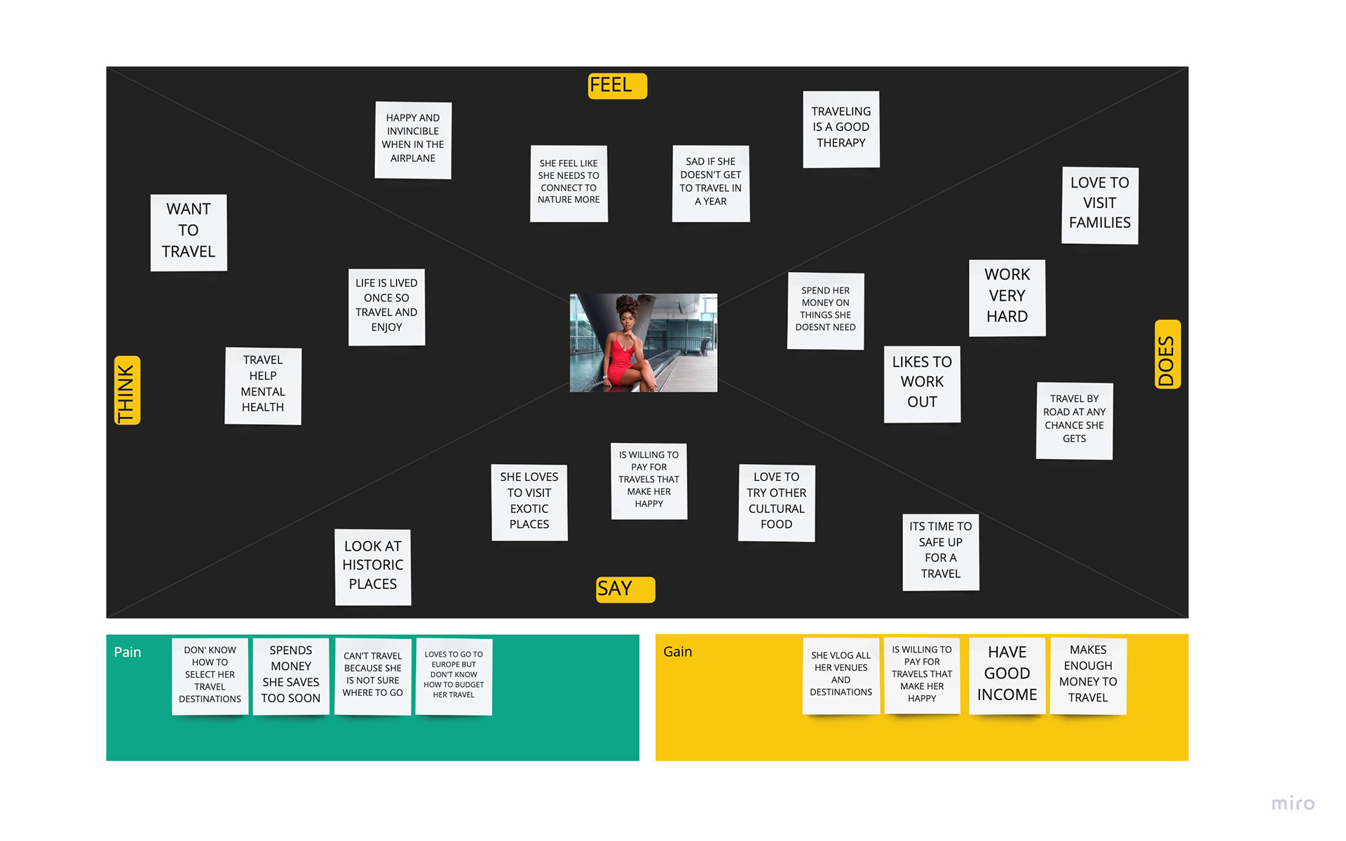
This Empathy map connects all of the user's feelings and how they will feel with or without the developed product. From the research, I was able to gather the user's sentiments. I determined their FEELINGS, THOUGHTS, SAYINGS, and DOES. I was able to emphasize both the users' Pains and their Gains in order to identify with them fully.
The reason for this mapping is to Emphasize our users. I tried consolidating my research findings into one user's feelings and experiences.
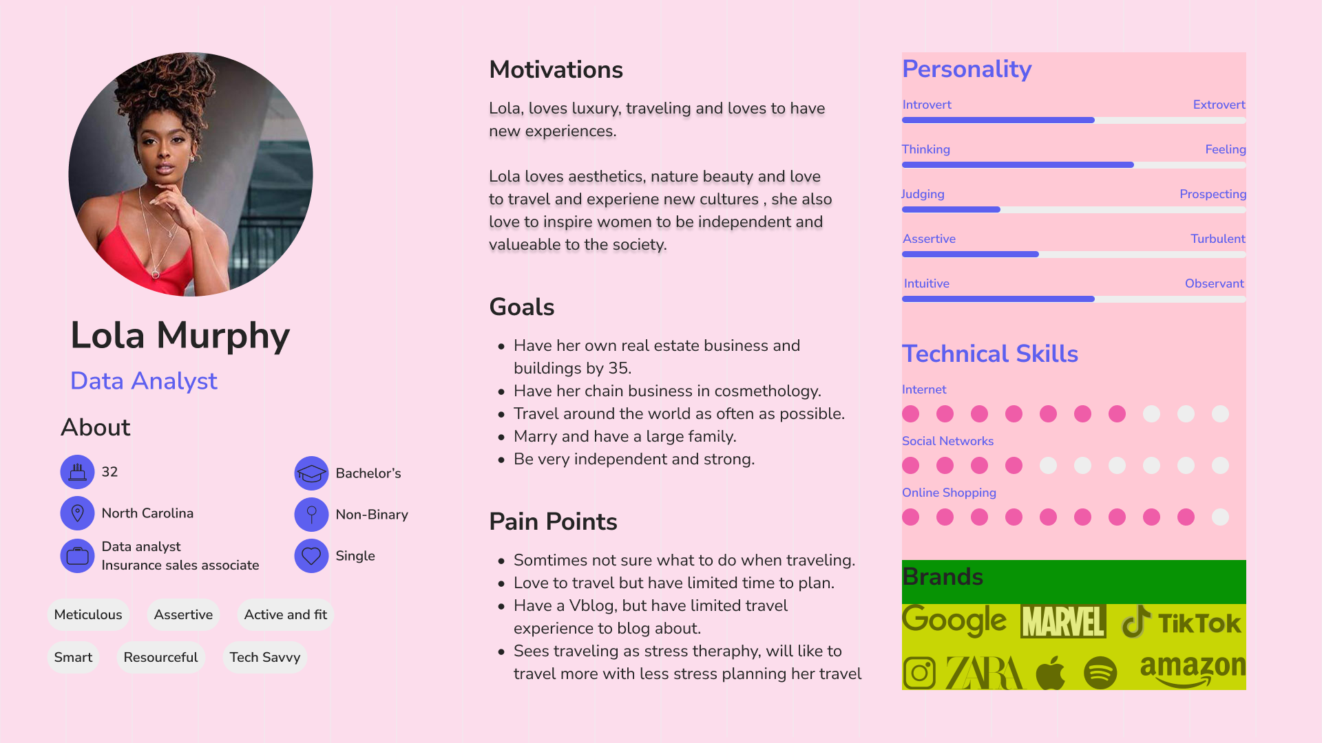
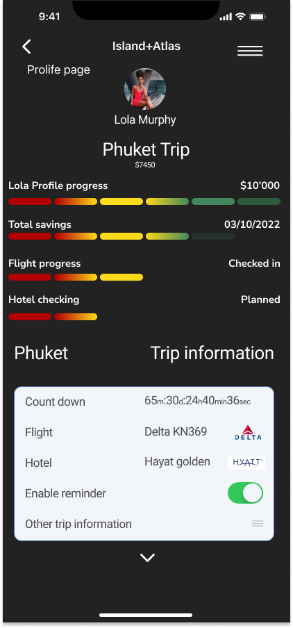
USER PROFILE
My final user personal gives an elaborate insight into the demographics of the user and their motivations, priority, and personality. Meet LOLA MURPHY. She will be our first use of the app.
DEFINITION AND IDEATION
I begin to define all of my findings from my research. I created a user insight, for the summary of what I found out about the users. I was able to compare and analyze different competitors, both direct and indirect competitors, I did that to identify areas of user needs that have not been met by other designs so I can explore.
I stated the problem statement so that the problem is clearly stated and can be addressed, and I was able to envision a user's journey.
USER INSIGHT
After a survey and research on about 15 users, I found out that individuals will like to have a planning platform that will guide them in saving towards their desired vacation, even though most individuals love to travel on vacation they still don't know where to go or how to plan for the trip.
Users need to have a saving plan, a vacation spot suggestion, and a trip planning schedule because vacations they can afford are good for their mental health.
We can help individuals that are financially stable, plan, suggest a good vacation destination, and have a savings plan for their vacation. If we can build an app that will give a vacation scheduling opportunity and create a spending and saving plan.
PROBLEM STATEMENT
Financially stable individuals find it hard to plan a vacation, save, schedule, and even find a good destination is hard.
How might we help our users, achieve a successful travel experience, providing a tailored made solution identifying their planning needs, the taste of travel locations, and financial constraints that will help them pick a saving plan for their vacations?
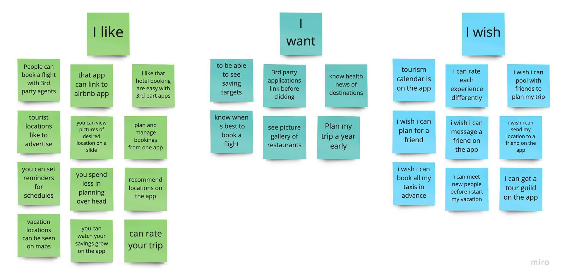
Ideation
During the ideation, I created a list of what the users WANT, what they LIKE, and what they WISH they can have on the app. I call this Ideation: I LIKE, I WISH, and WHAT IFs. The reason I did this is to work towards user satisfaction and design standard. With this ideation, I was able to design my feature priorities and what we may currently design, and what can be considered in the near future.
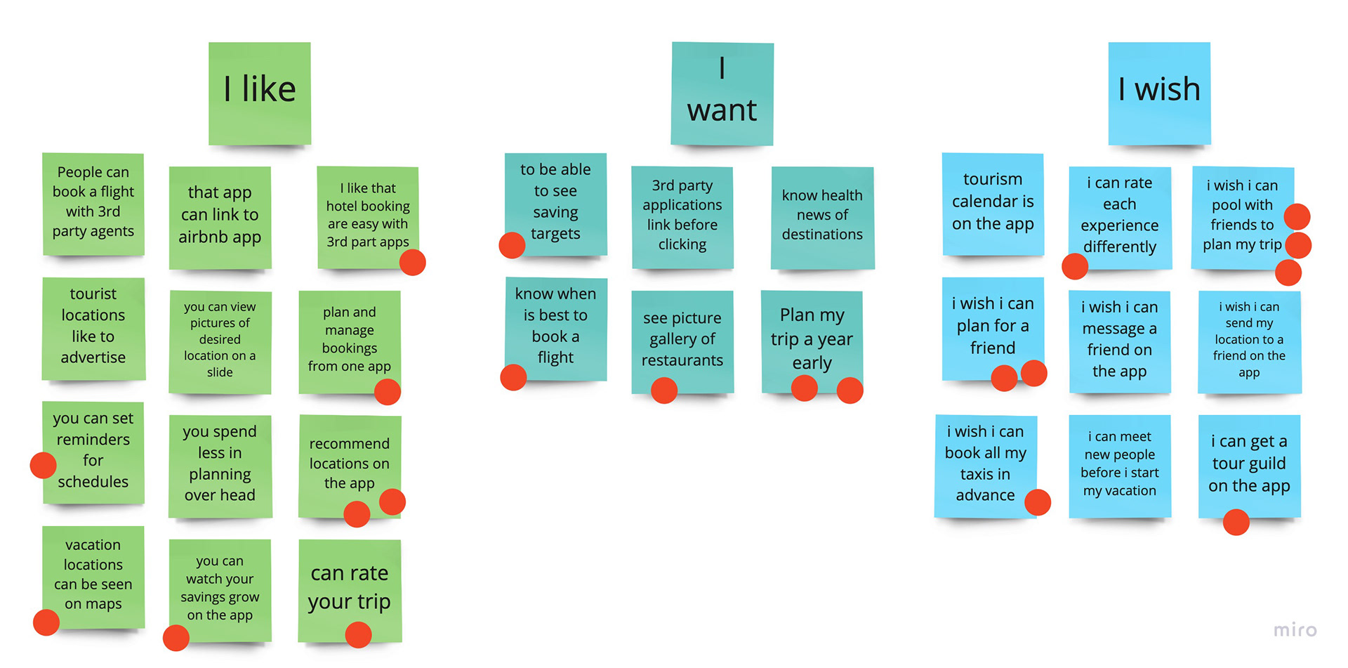
Dot Voting in Ideation, Identifying the concerns of what the user LIKE, WANT, and WISH is followed by voting on the priorities that users resonate with, that way we put the red dot, and the majority wins. The ones selected as a majority are plotted to determine how easy they are to implement or design.
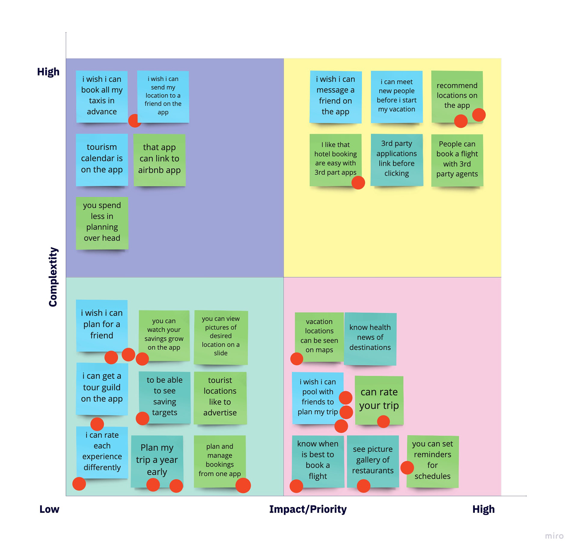
Feature Prioritization Matrix
The feature analysis was plotted on a feature matrix, which was created to observe the following highlights.
Ideation highlight.
1. Work on all low-impact and low compatibility
2. Work on easily achievable high-impact and low compatibility
3. Keep the high complexity and high impact for later.
4. Discard or keep high complexity low impact
Value Proposition
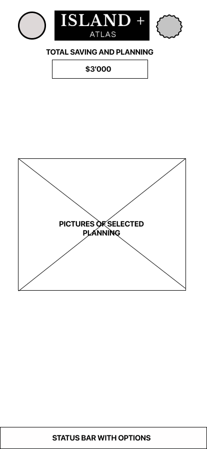
I am developing ISLAND + ATLAS to help FINANCIALLY STABLE INDIVIDUALS to solve PLANNING, VACATION SAVING, AND TRIP SCHEDULING PROBLEMS, that may arise when a trip or vacation is desired.
We’re better because, WE PAY ATTENTION TO CUSTOMERS' NEEDS, AND CONSTANTLY DEVELOP.
We’re believable because OUR APP AND DESIGN SPEAKS OF ITS VALUE.

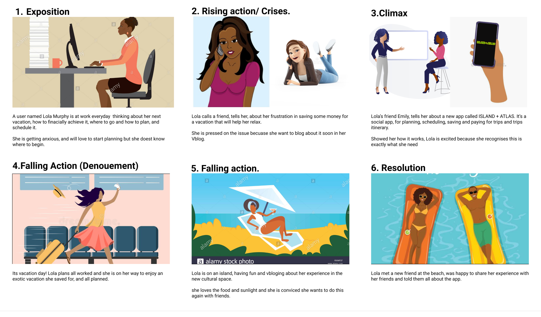
Story Board
This storyboard depicts a scenario where a user came in contact with the app for the first time. It details their journey to resolution and solving a travel problem with the app design.
Competition analysis

In another attempt to research what users want, and understand the other options that users want and need. I did a competition analysis, and I highlighted what the selected product did to please users and what they did to lose users.
I selected the following categories of users by direct and indirect competitors
DIRECT COMPETITORS
1. Trip.com
2. Expedia
3. Vamoos
INDIRECT COMPETITORS
1. Piggy goals money saver
2. Instagram
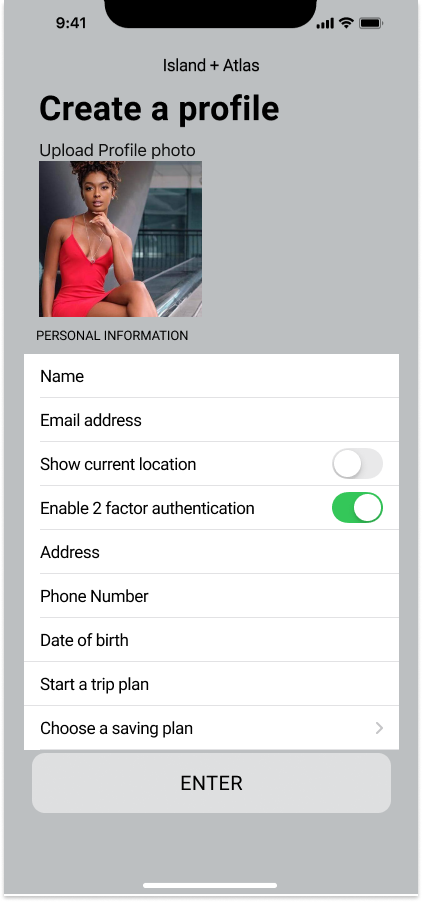
Prototyping, Testing, and Iteration
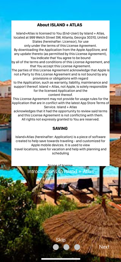
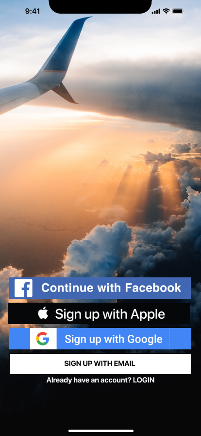
The prototyping started with designing user flow with the basic task of onboarding on the app, then the interface was designed sketch and the design was prototyped from wireframes to HiFi (High fidelity) level.
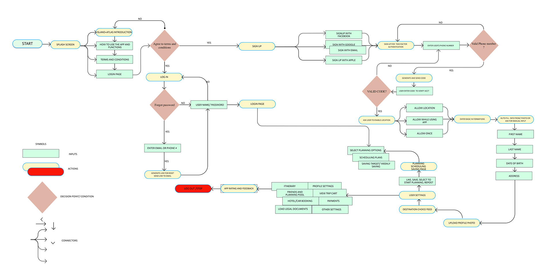
USER FLOW CHART

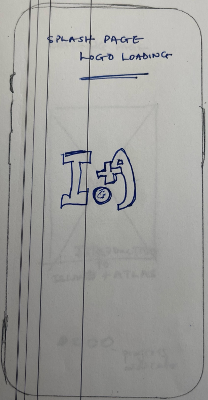
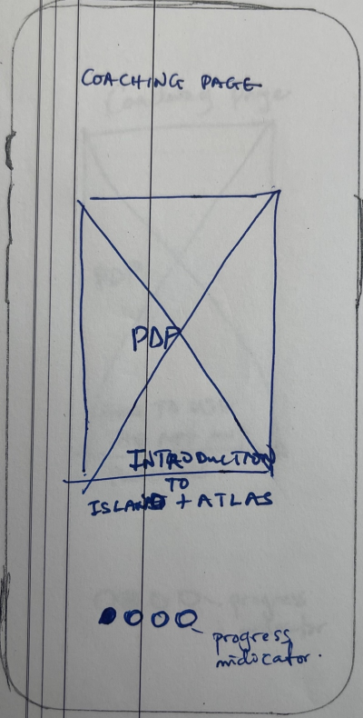
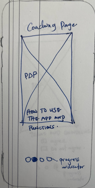
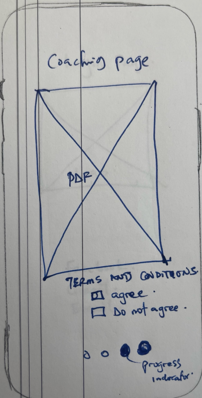
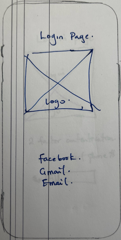
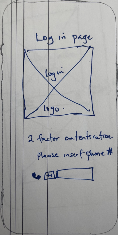
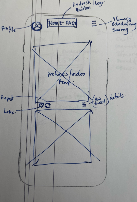
FRAME SKETCHES

DIGITAL WIREFRAME
I transferred the sketches into digital wireframe using Figma. this wireframe was designed to test the design and prepare for iteration and progress to the HiFi version of the design.


TESTING AND ITERATION
Testing started as early as the sketching stage. However, recorded testing was taken with the digital wireframes, the fails of the design were recorded and overall iteration was made.
My testing plan was to achieve a couple of stated tasks, including the following.
1. The validity of user task flow.
2. Clickability and the flow of the app.
3. To Show if the interface and the layout are understandable.
4. To see if the user task flow is implemented and easy.
A result was compiled and the success rate and completion rate were also plotted we achieved a 60% success rate and a 50% completion rate.

ITERATIONS AND HIGH-FIDELITY PROTOTYPE


KEY FINDING FROM USER TESTING
1. Guerilla testing: This was the first point of testing and it make me realize the flaws of the app concept and also make me understand the loud thoughts of a user while they go through the app. Knowing what they want and wish to accomplish.
2. The user testing makes iterations easier and it shows all the flaws of the app. It's A great way to start knowing that just designing doesn’t make an app perfect. Good user testing gives the app its first overhaul.
3. All participant in my testing was different and brought out different ideas for the development.
4. User testing makes ideas of what others may be looking at as perfect known to be flawed and get better fixes.
MORE TESTING AND ITERATION


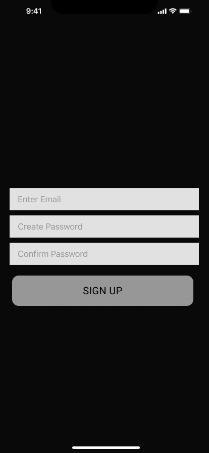
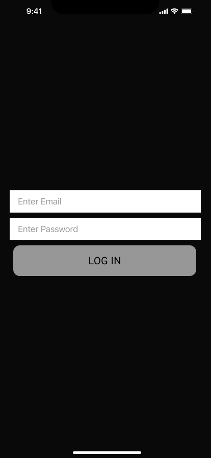
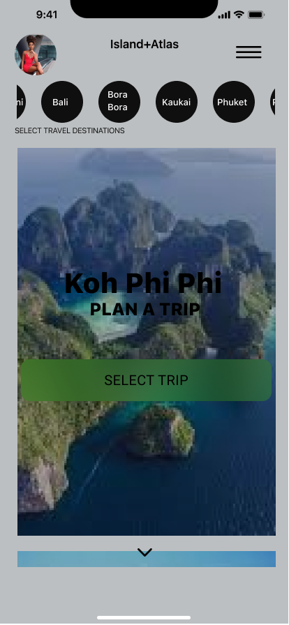
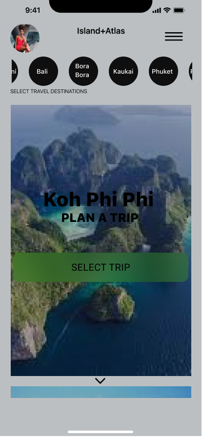


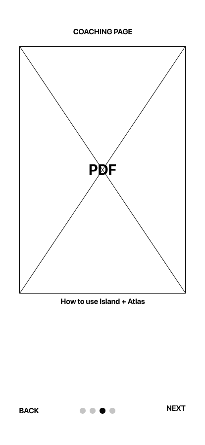
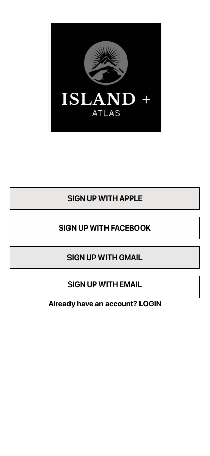
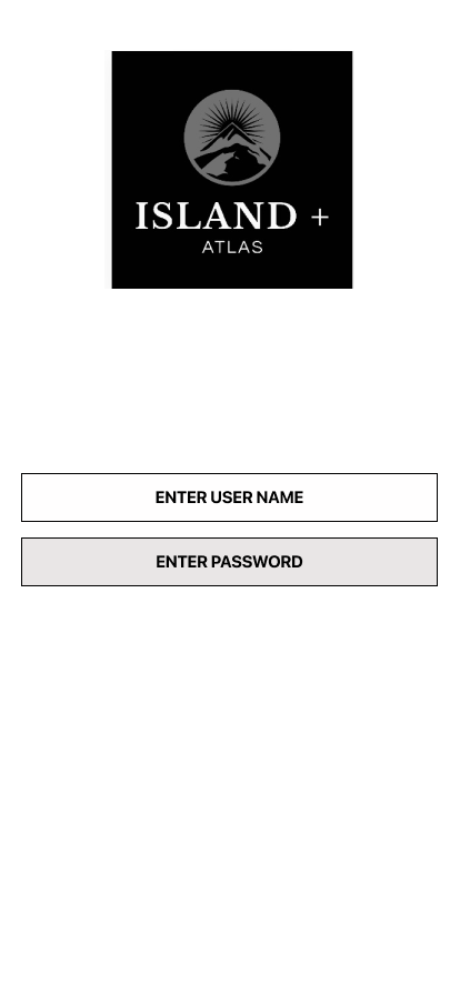
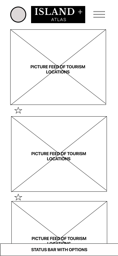
PROTOTYPE
Prototype
FINAL THOUGHTS AND CONCLUSIONS
started working on the app, with an idea in mind. Then a problem statement arises after my research and research analysis. The journey to solving this problem statement and providing a working app that will be user-friendly and engaging made it possible to know that Empathy and constant question on how to give the user a solution was possible.
This project was designed with the user in mind and an app that will engage the user with ultimately solving a tracing problem as well as a saving problem.
It’s as good as increasing the efficiency of our user’s money while we make them achieve their travel dreams.